

Monthly Archives: May 2013
–

” Tales by Post ”

*Philately* was probably my entire summer vacations from Grade 5 to Grade 10. Every household in Andhra Pradesh will definitely have one of their family or friends in the United States (read more about why *here*) and in the 90’s, sending and receiving letters, parcels and greetings from the States was pretty common. My aunt, Sajini, used to remember every birthday or occassion in our family and used to mail very frequently and that’s how those colourful stamps of the US caught my attention sometime around 1995 (that’s what my first stamp book says), a break from the 1 rupee Gandhi stamps which were the order of the day for Indian stamps those days.

She graciously used to bring a whole stock of stamps from different countries every time she visited India, courtesy her international friends at college in the States, who used to get mails from their families abroad. This is probably how all the philately maniacs those days used to stock up on their collections.
All the ‘doubles’ used to go for trade, in exchange for countries which one did not have and competition was usually between who had the maximum number of stamps and who had the maximum number of countries. My first achievement was when the first book filled up and I upgraded to a bigger one, and in another year, a much bigger one and all three at one point of time were overflowing with stamps. I particularly remember this school friend of mine, Kartik, who shifted to Tanzania and used to come back every summer, used to give me a host of African countries with ‘doubles’. Those days, African stamps were rare (atleast in this part of India) and they used to be my numero uno’s to ‘buy’, say, a Pakistan or a Samoa Islands, or a Chile or a Mongolia, understandably rare in India.

*Tales by Post* is a blog which I recently started where I’m attempting to document around 3000 stamps from 113 countries, trying to figure out patterns in history and government policies. For example, a number of Indian stamps were issued in the 1990’s about Family Planning and publicising the ‘Small Family, Happy Family’ programme of the government, when they realised the population was going to spiral out of control soon. Australia released a number of stamps during the late 90’s encouraging families to live together. Most of France’s stamps showcase their rich art and their artists, Bhutan’s stamps are the most innovative in terms of the materials used – they even have 3D stamps.


%% Elevation addiripovaali %%
.. loosely translates to, “The elevation should be kickass. No, I don’t care if I have a comfortable house, or if the kitchen and dining areas are at the opposite ends, or if I’m made to climb a floor, with a staircase outside the house to use the toilet, but the elevation of my house should be mind blowing.”
Woes of a fresh graduate trying to make a difference
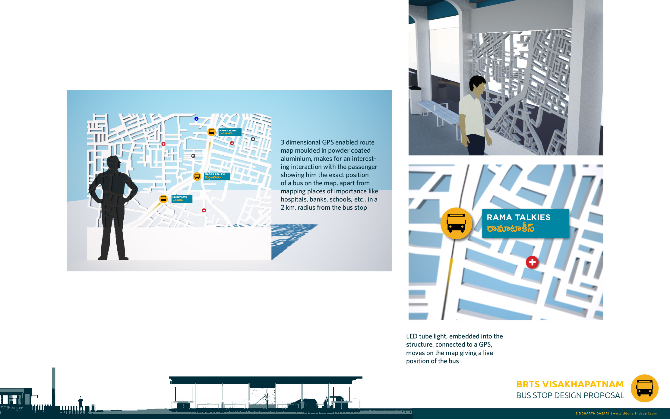
== BRTS Visakhapatnam Bus Stop Redesign ==
So it took more than a couple of weeks, after I started work on the redesign of the BRTS Visakhapatnam bus stop, after venting out my issues with the current one, in a previous blog *post*. It was a wonderful exercise as I believe this is the first one where I tried to combine my understanding and learning from architecture and graphic design. It did feel really good while attempting to solve the problem, as I was looking at it from numerous perspectives – as an architect and a communication designer. I tried to keep the design of the bus stop as simple as possible, because I want to pitch it to the local authorities and I’m sure, experimenting with forms (I made atleast 8 iterations just for the form of the roof, taking inspiration from the sea waves, local basketry art forms etc., and finally settled with a flat one) and adding more facilities could be met with a lot of resistance from the various agencies involved.
This is also the first time that I’ve used a Telugu font in a project. It was a nightmare to search through each and every single glyph to type out a word, as I tried hard to learn to type in Telugu, but it was just too complex to master in a short span of time. Also realised and understood the lack and unavailability of good Telugu fonts on the web.
Here are some slides from the presentation I made.


You can take a look/download the entire presentation from *here*
=

<< Indian Railways Information Kiosks <<


I end up comparing every public design interventions in India with what I’ve seen in Europe and wonder why we cannot replicate them here. Most of the time, ‘designing for a billion people’ trumps that thought, but I’m sure, hiring or even consulting trained and educated designers in government organisations could bring about a change.
Last week I travelled from Visakhapatnam to Hyderabad with my aunt, who has a problem with one of her legs and I cannot describe my feeling of anger and disgust at the attitude and approach of the Indian Railways while designing coaches and platforms, with no empathy whatsoever for people with disabilities. For starters, there is a neat 1 feet gap between the platform and the coach, which is atleast 2 feet higher than the platform. A physically challenged person needs 2 people to help them get into the coach. Ramps and escalators are non existant in major stations. Wheelchairs weren’t found anywhere. We’ve heard that they are available ‘on request’, but with no signs of any telephone numbers or information.
About the kiosks, I’ve seen this for the first time and I actually quite liked how the system worked. The instructions were easy and the letters were legible, though the Hindi and Telugu interfaces were a little more difficult to use. My complaints were the height of the kiosk which started at almost 4.5′ which I think would make it a tad bit difficult for shorter people. The application got stuck a lot of times and there was no ease while entering information and selecting options – like the Aakash tablet. Also, there were only 2 kiosks for the entire station. Sent a mail about these issues to the Divisional Manager, East Coast Railway – I’m not expecting much.
